HORIZON
I was brought in by Richard Chapman Studio to help with a rebrand of Horizon Private Wealth, an international and ethical financial advisor, operating from Hong Kong and London. My role in the project spanned concept generation and development of the clients preferred route.
-2021
All work © Richard Chapman Studio
Concepts

Route 1
I wanted to explore a way of seeing the horizon, the hot air balloon offered 360° viewpoint while also feeling like a more intimate experience. This was our recommendation of the three routes and the client agreed, asking us to develop the concept.
I wanted to explore a way of seeing the horizon, the hot air balloon offered 360° viewpoint while also feeling like a more intimate experience. This was our recommendation of the three routes and the client agreed, asking us to develop the concept.
Route 2
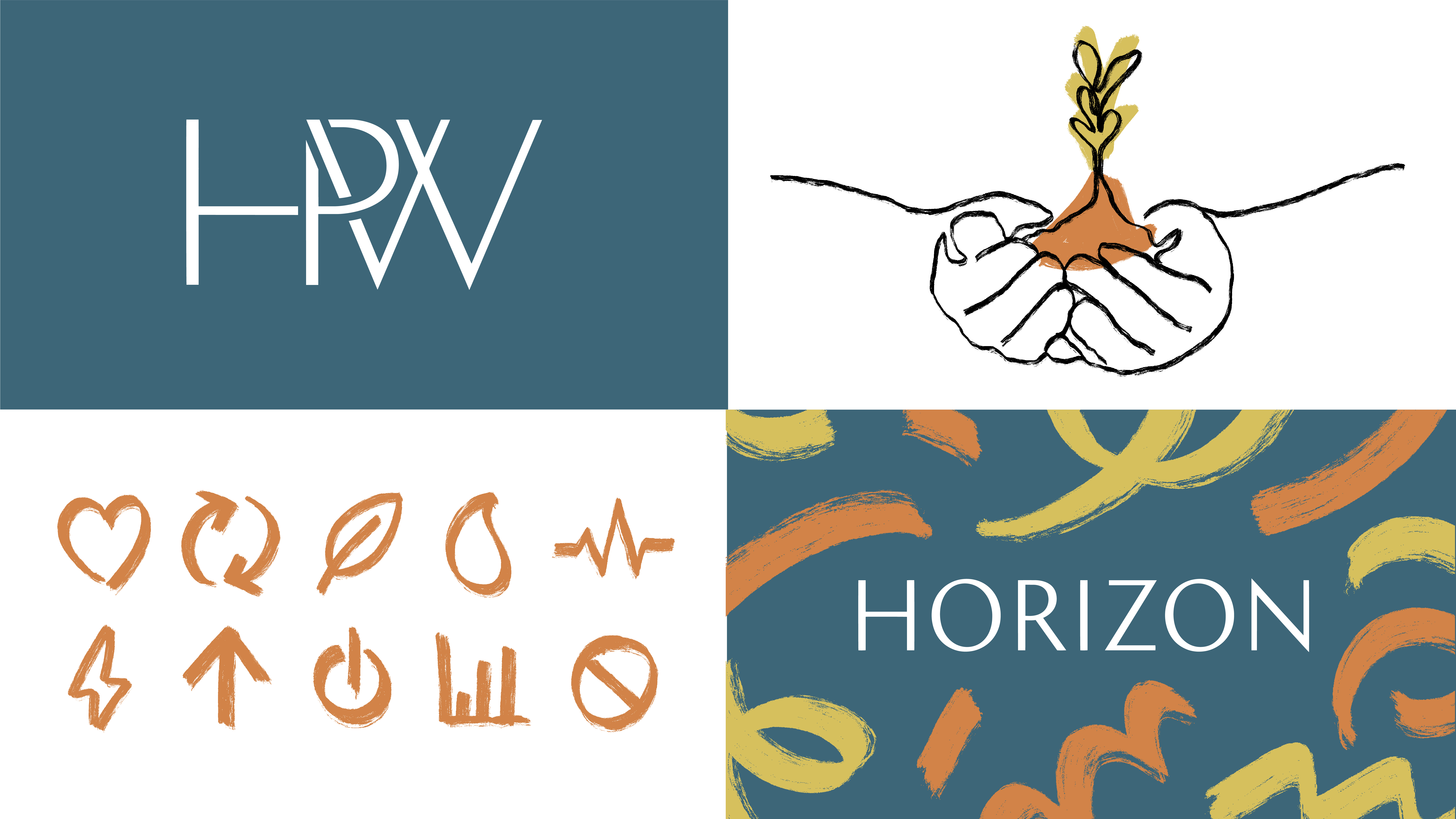
Horizon’s previous brand utilised hand drawn line illustrations, something the client was keen to bring forward in the rebrand. Here, these were updated and built upon, adding energetic icons, pattern and colour. I balanced this with a sophisticated logotype and monogram, grounded by a muted base colour.
Horizon’s previous brand utilised hand drawn line illustrations, something the client was keen to bring forward in the rebrand. Here, these were updated and built upon, adding energetic icons, pattern and colour. I balanced this with a sophisticated logotype and monogram, grounded by a muted base colour.
Route 3
The final route took inspiration from the first light of the day and its creeping influence of casting strong highlights and shadows. This affected how the logo would display on a light or dark background. These sharp angles created were carried over to the serifs of the display face and design furniture.
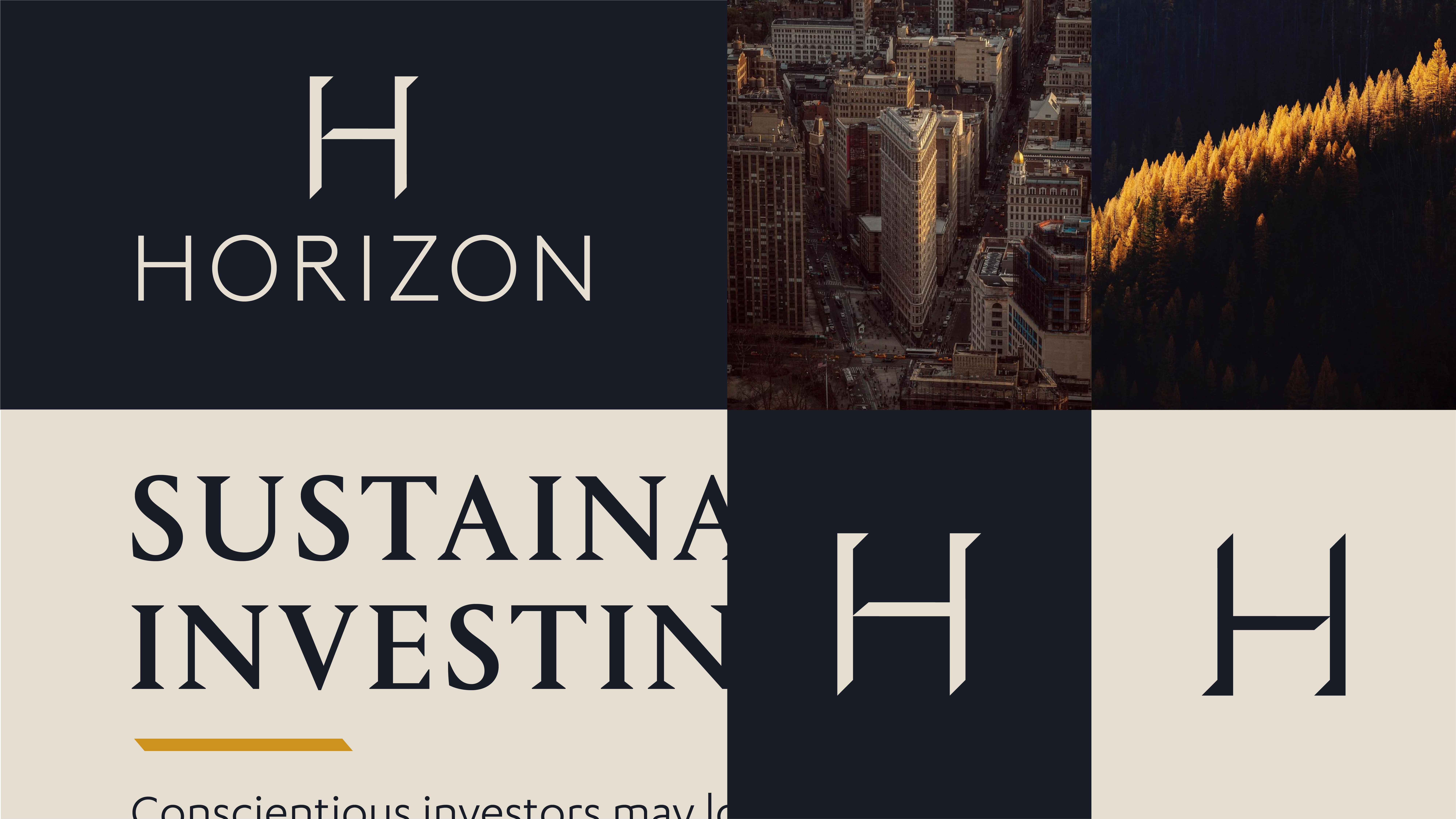
The final route took inspiration from the first light of the day and its creeping influence of casting strong highlights and shadows. This affected how the logo would display on a light or dark background. These sharp angles created were carried over to the serifs of the display face and design furniture.
Development
Crafting into the hot air balloon
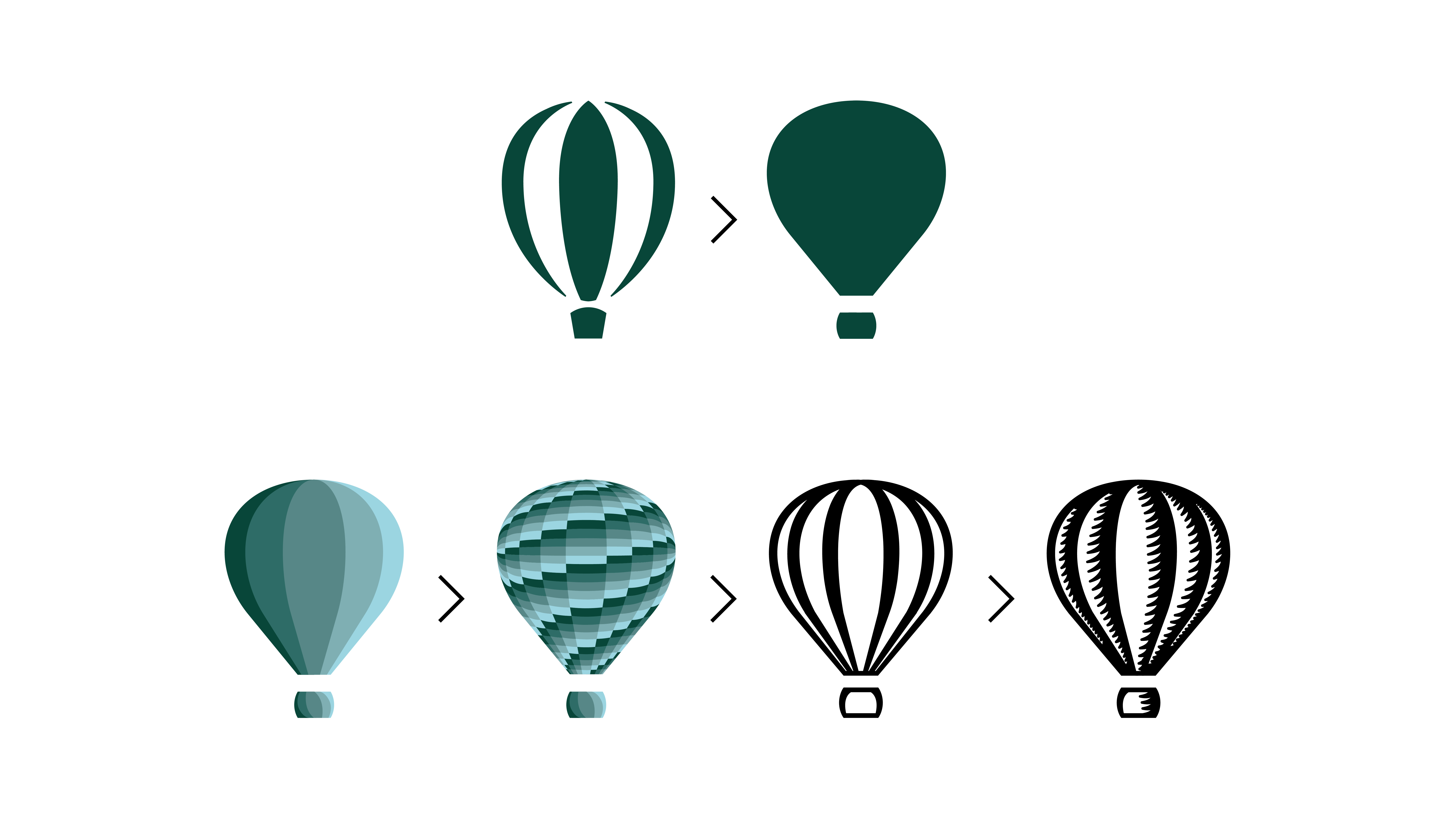
With the concept nailed down, we had the opportunity to craft and expand on all parts of the design. I started by redrawing the balloon to be a more accurate and dramatic shape. I then tried various experiments to see how best to give the balloon depth.
With the concept nailed down, we had the opportunity to craft and expand on all parts of the design. I started by redrawing the balloon to be a more accurate and dramatic shape. I then tried various experiments to see how best to give the balloon depth.

Crafted mark
This version, which utilises a woodcut-like technique, had a hand-crafted and traditional look which resounded with the service and trust of Horizon. If this went ahead, it would have been great to commission the likes of Chris Wormell or Andrew Davidson, however later development rightly updated the logo inline with the rest of the assets. For this stage, it was used throughout.
This version, which utilises a woodcut-like technique, had a hand-crafted and traditional look which resounded with the service and trust of Horizon. If this went ahead, it would have been great to commission the likes of Chris Wormell or Andrew Davidson, however later development rightly updated the logo inline with the rest of the assets. For this stage, it was used throughout.

Mark + Logotype
I played around with the placement of the balloon, wondering whether it should be slightly raised or above. The logotype creates a relatively flush baseline which felt like the appropriate place to sit the balloon, the logo’s own little horizon.
The logotype developed from a heavier weight of Orleans by Commercial Type used in the concept stage, to feel more refined, matching the weight of the balloon mark.
Logotype + Subline

Typography
I decided to use a lighter version of Orleans, as previously used for the logotype. Its elegance brings authority and confidence, while striking the right tone with their clientele.
Calibre Light was chosen for sublines, so as not to overpower the lightest areas of the headlines. While body copy uses a regular cut of the same typeface for balance and readability.
Typography credit: Commercial Type, Klim Type Foundry.

Photography
Part of the first stage concept was for photography to be shot from an elevated view point, giving reference to the hot air balloon without seeing it. These dramatic viewpoints also communicated the possibilities ahead and can nod to the ethical side of the business.
Photography credit: Alex Strohl, Humza Deas.


Tone of Voice
The tone of voice ties in with both the financial side of the business, and the journey opened up by the balloon metaphor.
The tone of voice ties in with both the financial side of the business, and the journey opened up by the balloon metaphor.

Colour Palette
The core green, blue and white are used for the masterbrand and throughout. While a fresh set accent colours offer interesting combinations and unexpected use.
The core green, blue and white are used for the masterbrand and throughout. While a fresh set accent colours offer interesting combinations and unexpected use.


Set of Patterns
I created a set of patterns based on traditional hot air balloon patchwork. These map the spherical shape for added dynamism.
Application

System Exploration
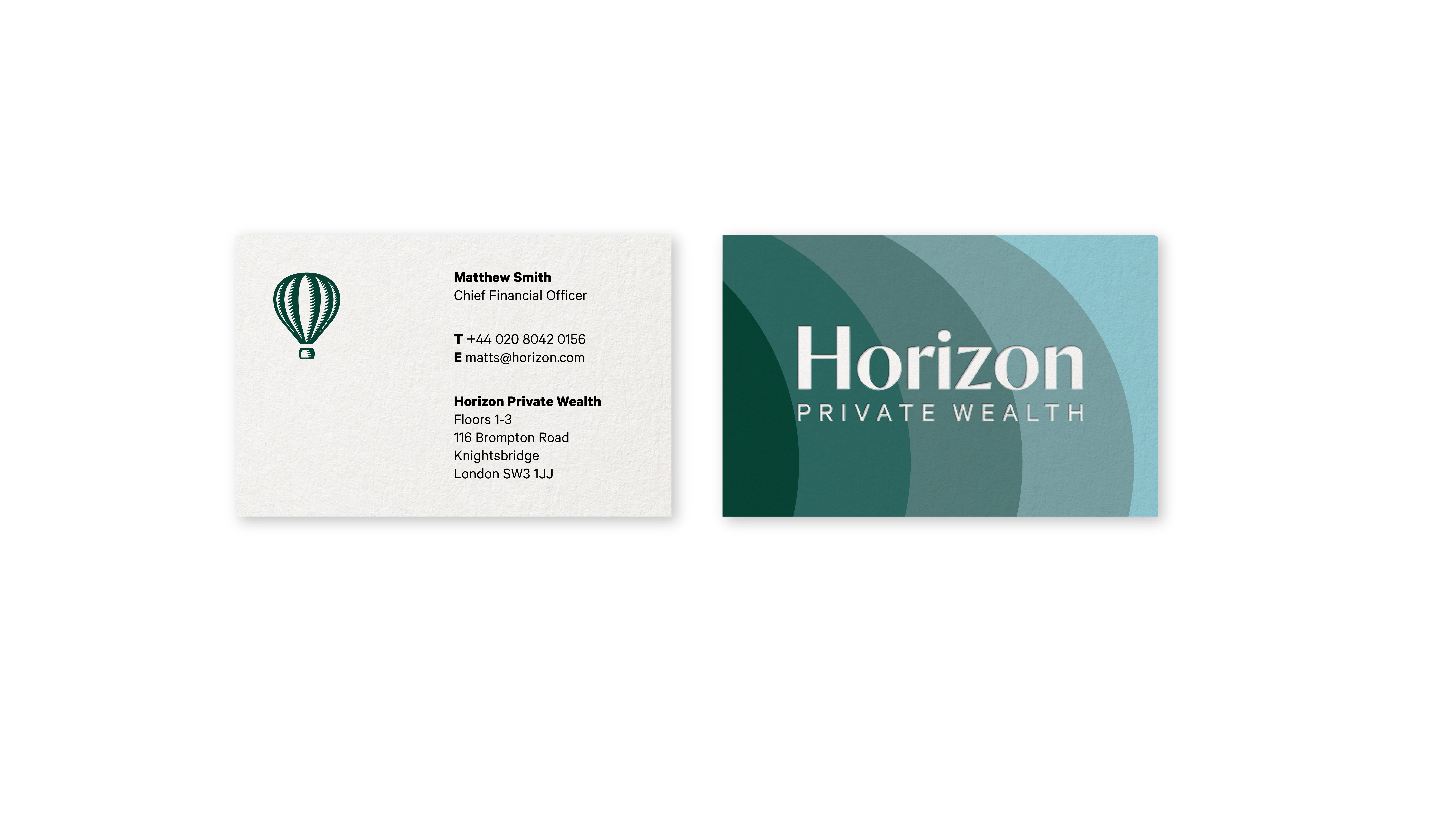
Business Card

Billboard Ad
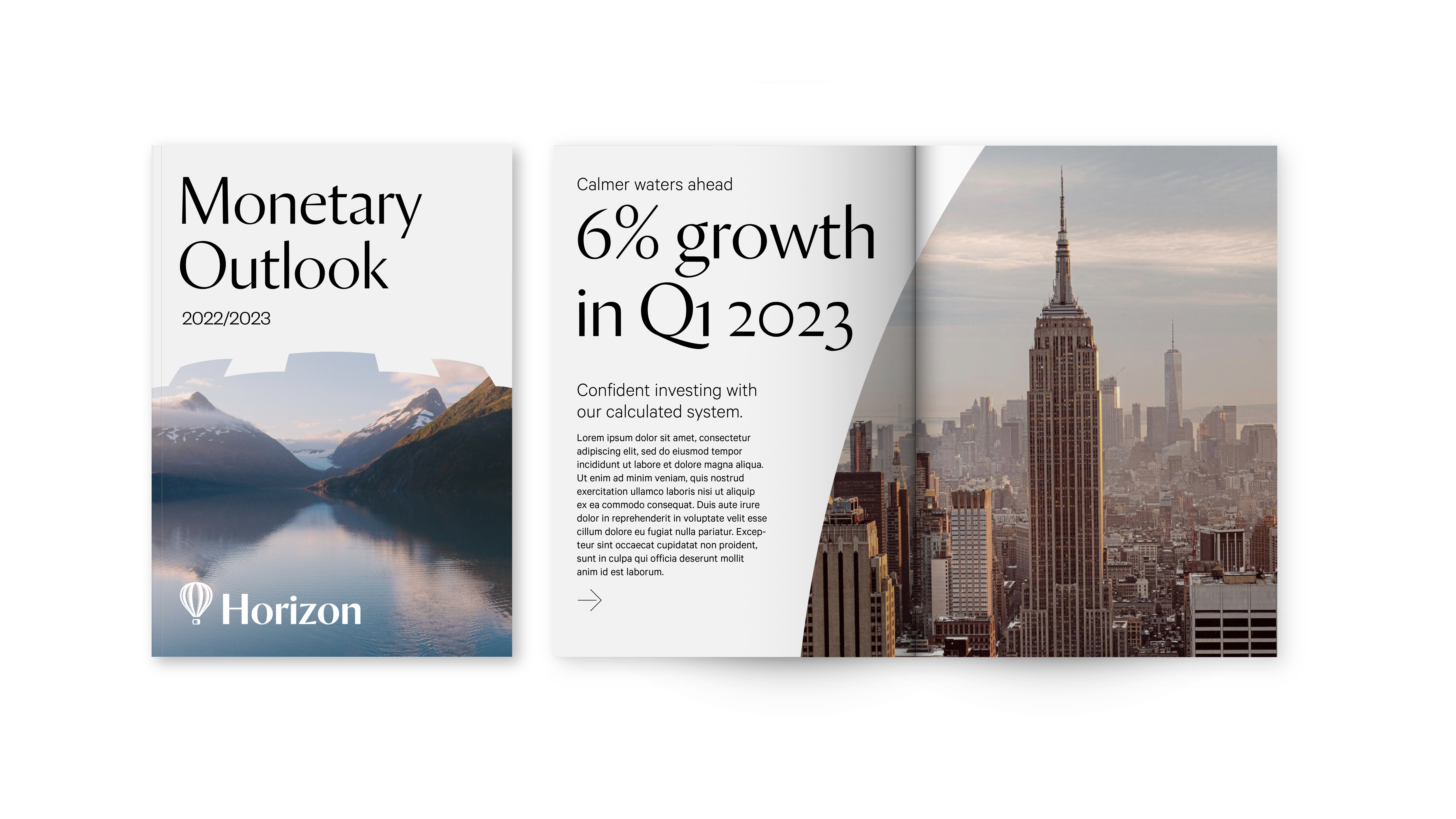
Literature
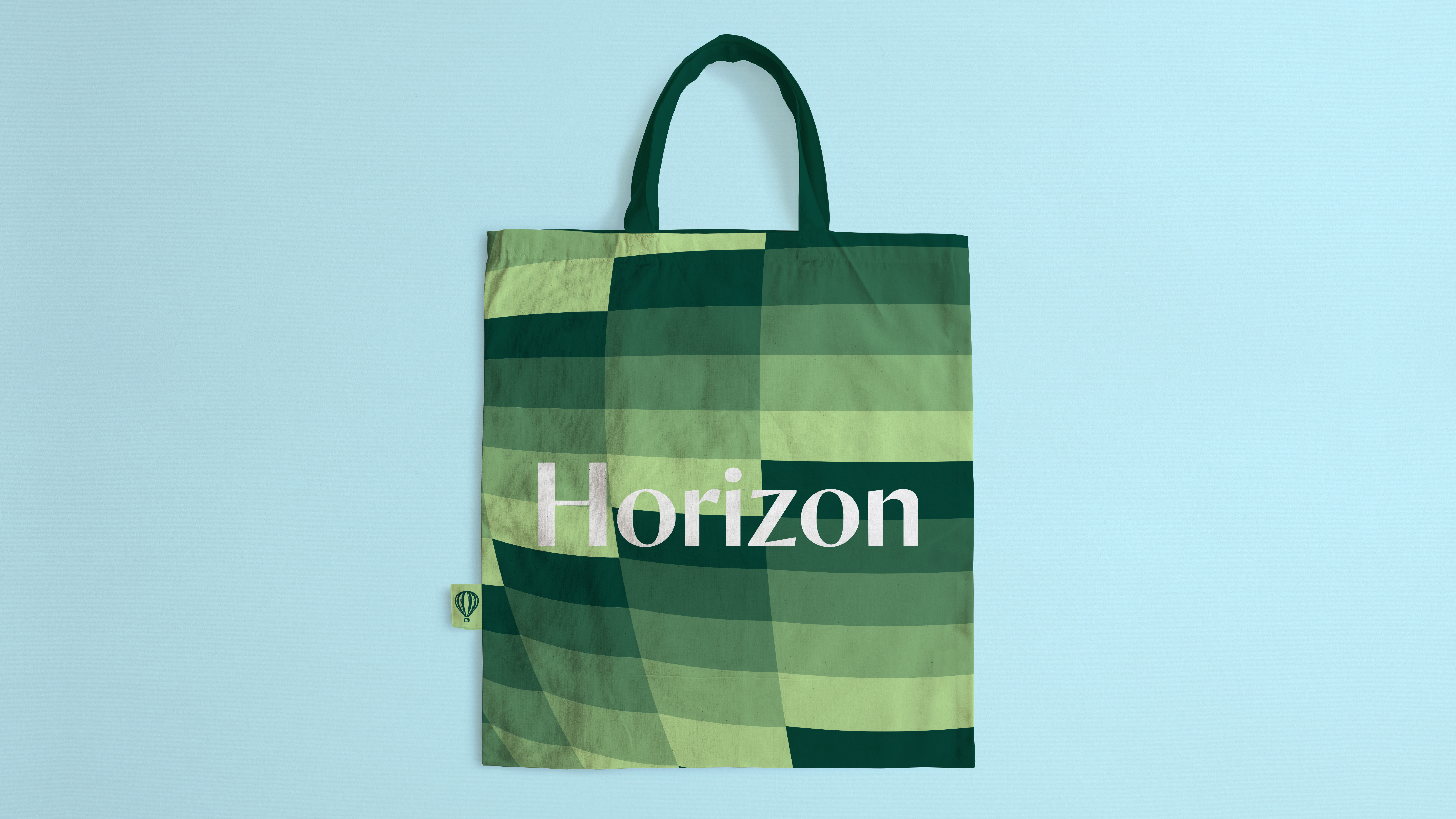
Tote Bag
![]()
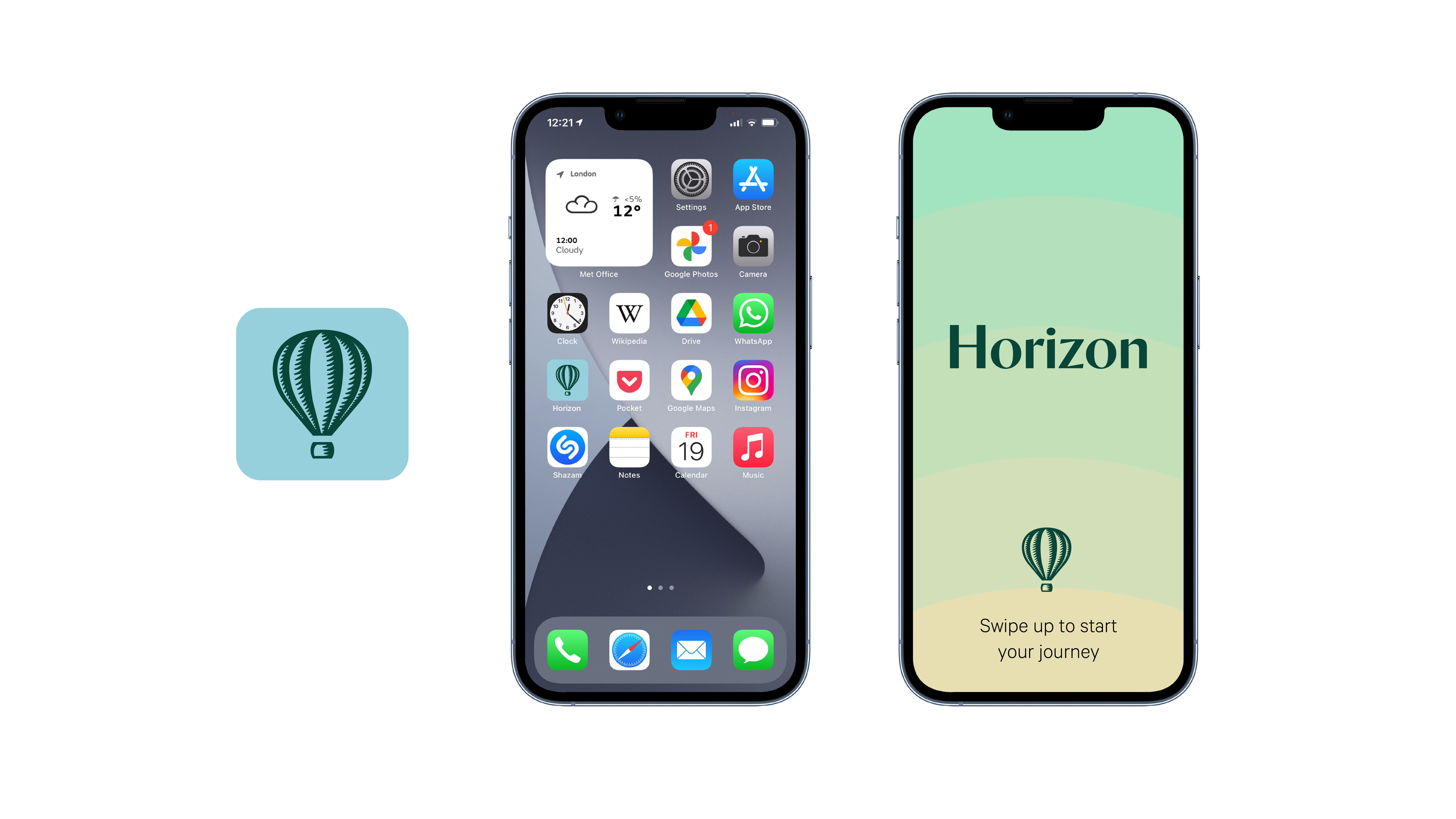
App Icon & Launch Screen
This is where my part in the project ended after a wonderful collaboration with Richard and his team.
See how the project developed on Richard Chapman Studio.
View the delivered Horizon website.
This is where my part in the project ended after a wonderful collaboration with Richard and his team.
See how the project developed on Richard Chapman Studio.
View the delivered Horizon website.